

With the onset of mobile-first indexing, the market has flooded with the clients demanding for a mobile-friendly website.
A rise in the usage of mobile-optimized websites have been noticed since then, a large section of the buyer base has shifted to “mobile only” space. This lays special emphasis on the usage of mobile-optimized websites and enhanced mobile user experience because a substantial part of society from younger generation to baby boomers, all are spending a large time on their smartphones and making a decision.
Mobile-Friendly vs. Mobile Optimization: What's The Difference? Share on XA mobile-friendly website is a smaller version of the desktop website that makes it easier to browse and consumes less data due to smaller images sizes. On the other hand, mobile-optimized websites are specially designed for mobile users that feature large buttons and reformatted pages which makes navigation easier.
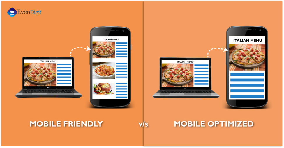
Mobile-Friendly Vs. Mobile-Optimized
Now that we know how important a mobile website is then, the second thought that stays in mind is how different terminologies that come with a mobile website, impact your business. It includes terms such as mobile-ready, mobile-responsive, mobile-friendly, mobile-first, mobile-optimized, and more!
However, when the clients are given the option for mobile-optimized websites they are perplexed. All mobile-optimized websites are mobile-friendly but, are all mobile-friendly websites mobile optimized? Confusing right!
Recommended read: Jump-start Your Conversion Rates With These Explainer Video Marketing Hacks
So, here are three important points to consider when opting for a mobile website which could clear your confusion:
- Purpose of the website
- What do you expect your visitors to do?
- How do you expect your visitors to access your website?
What is a mobile-friendly website?
A mobile-friendly website is more inclined to the mobile design strategy to engage visitors. Initially, these were referred to sites that could be viewed on mobile. These are focused on mobile users and are typically trimmed down in the mobile format. However, a smaller version of your desktop website can fit in your smartphone but, it doesn’t guarantee enhanced user experience, improved ranking in SERPs, or maximize leads and conversions.
These websites are designed in an old-style that requires you to zoom in to read content or to click on the links which are not considered that user-friendly. But, the irony is Google’s mobile-friendly test that doesn’t consider such websites appropriate and required to convert into mobile-optimized websites.
What is a mobile-optimized website?
A mobile-optimized website is designed keeping in mind the mobile-first approach. These are actually different from the traditional desktop websites which are reformatted for mobile users. The goal of a mobile-optimized website is to make the site frictionless for mobile users. The reason behind providing your users with a different mobile-optimized website is that mobile users navigate, read and act differently.
It is a similar version of what you see on your desktop but, differs in the number of pages or domain names. It is required a separate domain to display which is auto-detected with the letter “m” before your domain name and points the visitor to the mobile version.
Recommended read: Top 10 Ways to Embrace Digital Signage for Digital Marketing
Unlike mobile-friendly websites, these websites have a large number of pages that positively affect your SEO. However, getting a mobile-friendly website is a much cost-effective option but, it lacks all the information that is displayed on the desktop website. On the other hand, a mobile-optimized website can pass the mobile-friendly test from Google and seems to be the best practice.
Apart from this, if you have a large customer base cruising your website from mobile then, it is the best option for you. Especially if you have an E-commerce website, blogs then, a website is the one that can offer a creative user experience that your visitors would love to visit your website again and again.
Here are some mind-boggling stats that represent the future of mobile-optimized websites and how is it going to impact our lives:
Source – http://frontburnermarketing.net/37-mobile-optimization-stats/
- 50% of the mobile search is targeted at the local businesses
- People spend 66% of their time on e-commerce on smartphones
- 50% of mobile phone consumers frequently visit a retail website within 24 hours of a local search on mobile
- “Call Button” is believed to be critical on a mobile website by 70% of smartphone customers and 77% of tablet consumers
- It is reported that around 70% of mobile customers clicked the call button to call businesses directly from Google ads
- Local businesses leverage mobile searches as around 61% of them result in a call
- As consumers make a call to the business over 50% of them are already in the process of researching a product or seek to make a purchase
- According to Google mobile search stats, more than half of all search volume results from smartphones which is quite surprising
- 51% of searchers would probably make a purchase from a mobile-optimized website
- One-third of all e-commerce purchases were made on a smartphone during the holiday shopping season
- 40% of mobile consumers abandoned a mobile website owing to bad mobile web experience and continued to a competitor’s website
- 48% of mobile consumers believed that the company just didn’t care about their business after making a visit to a website that’s not mobile-friendly
Aren’t these stats surprising?
It is strongly recommended to have a look at these stats if you think your traditional business is doing fine without a mobile-optimized website. Keep in mind that mobile users can take pictures, videos, make phone calls and use GPS which can be of great help for the local businesses. You need to think from the user’s perspective as to what type of experience you would probably like to have when using your website. There are endless opportunities that come with the internet where the limit for growth seems almost diminutive.
Mobile-Friendly or Mobile Optimized, Which One is Better?
A mobile-friendly website is just a smaller version of the desktop website which can be functional on tablets and smartphones but, it is not designed to provide a better user experience. With the massive change in Google’s algorithm update which stated that websites which are not mobile-friendly will not show up in the search results gave a shock to the businesses. And this is the reason they had to come up with this very basic and minimum requirement that fulfilled their mobile design strategy. To check whether your site is mobile-friendly or not, you can go for Google’s webmaster tools.
A mobile-optimized website is built using a mobile-first approach with the objective of making it as frictionless as possible for mobile users. People spend around half a day on mobile which implies that mobile browsing is the most popular activity. People rely on mobile websites for everything they do and use it for multiple purposes such as finding restaurants, finding directions, product, and service reviews. This all contributes to the need for enhancing mobile experience and businesses do have to think from their customer’s perspective so that they can move ahead to fulfill their need. And, this is the reason that businesses need to get their website optimized.
A mobile optimized website is a better option where you can deliver what your customers want as they generally reach out to your with the approach of getting their answers in short. Moreover, businesses have endless opportunities to make large profits out of every service through their website.
Final Word
Converting an older static website into a website that offers enhanced user experience for smartphone and tablet users can be a bit challenging as it would require to rebuild a website from scratch. But, look at the brighter side and the changing scenario, you would find yourself in a better position in the long run. As mobile websites are pretty high on-demand, you are advised to consider the above-mentioned points before you choose the option for yourself. Analyse the purpose of your business and then decide accordingly.
General FAQs
A responsive website is one that changes based on the screen size of the device. Responsive websites react with the user in mind, and enhance usability no matter what the device is. Mobile-Friendly Design. Simply put, a mobile friendly site functions the exact same way regardless of the device.
Mobile optimized websites allow more customers to be reached at a quicker rate, proving to be very beneficial. A crucial advantage is that it can increase customer satisfaction. Having a mobile friendly site will only benefit your website’s reputation, making it look modern and relevant.
What Is Mobile Responsive Design? When a website is responsive, the layout and/or content responds or adapts based on the size of screen they are presented on. A responsive website automatically changes to fit the device you’re reading it on.


